RoadToMastery is an analysis of League of Legends' 350K+ champion mastery data entries, based on 60K+ NA Platinum+ players. Besides some general counters, the web app features two kinds of analysis on all champions: mastery progression and Tier 5 averages.
The numbers of mastery progression show the average improvement/regression when mastery of a given champion levels up from Tier 3 to Tier 4, or from Tier 4 to Tier 5. For example, Rengar has a 0.538 on average number of kills per game, which means that a player typically gains an extra 0.538 kills when reaching a higher tier on Rengar.
When players reach Tier 5 of a champion, we assume that they have deep enough understanding of it. So what kind of contributions does a Tier 5 champion x make on average? For any given champion, the average performance of all Tier 5 summoners is calculated, leading to a "profile" of a typical Tier 5 game stats of that champion. On the champion's page, you can see how the Tier 5 profile progresses from Tier 3 or 4 on the radar chart, or get some food for thought by comparing you own ranked stats on the same champion with the Tier 5 profile.
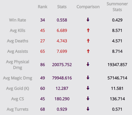
For each of all the stats above, RoadToMastery shows a ranking of all champions. From there, you can get a glimpse at the what kind of role a champion plays in the League. But of course, the rankings are subject to different interpretations, so feel free to weigh in!
From the API endpoints provided by Riot. Only Platinum+ player stats are included for the analysis since they in general already have a good grasp of the gameplay, and their champion stats should contain relatively less noise.
By doing a linear regression between the mastery tier and the metric we are interested in. For example, for progression of win rate on Gangplank, firstly a number pair of (mastery tier, Gangplank win rate) is obtained from all Gangplank summoners. Then we put all the mastery tier data on the a chart's x axis and all the win rate data on the y axis, and try to put a straight line on the chart to best fit both data. By this, we are essentially asking, what kind of win rate on Gangplank we can preidict if we know a summoner's mastery tier on him? Once we know that straight line, the slope of it, also the delta difference of win rate of two consecutive mastery tiers, is the progression metric we report.
Of course, whether using linear regression to model data with discrete levels like mastery tier is up to debate. Here I am using it as a preliminary method to pulse-check the data.
For each champion we trace the Tier 3-5 average stats on the radar graph, highlighting the difference among different mastery tiers. For instance, in this radar graph of Gangplank below, we can see that as a player climbs the ladder of mastery tiers, all stats of kills, deaths, assists, physical damage, gold, cs and turrets improve. The net result is the boost in win rate.
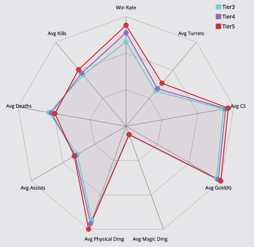
Note that the relative position on the radar graph is based on the percentage of the highest achieved value on the given metric among all champions.
The site itself is based on ASP.NET MVC 5 framework, and this is actually the first time I tried it. I'm also using this opportunity to experiment with bootstrap for easy layout styling and d3.js for svg charts. The site is published as an Azure web app.